
Menu
Menu
NomadNest Booking
A travel booking experience redesigned for trust, speed, and discovery.

Inhalte

Overview
Why?
Development Process
Why Choose?
Related Project
Get in Touch
FAQ's

Improving travel booking clarity for faster decisions and fewer doubts
The previous travel booking experience created unnecessary friction for modern travelers, making important information harder to find, compare, and trust before taking the next step forward.
We redesigned the journey around confident stay selection, simplifying content order, improving hierarchy, and removing confusing moments that slowed users during key decisions.
The final system gave modern travelers a more focused experience with clearer messaging, stronger interaction patterns, and practical guidance across the complete journey.
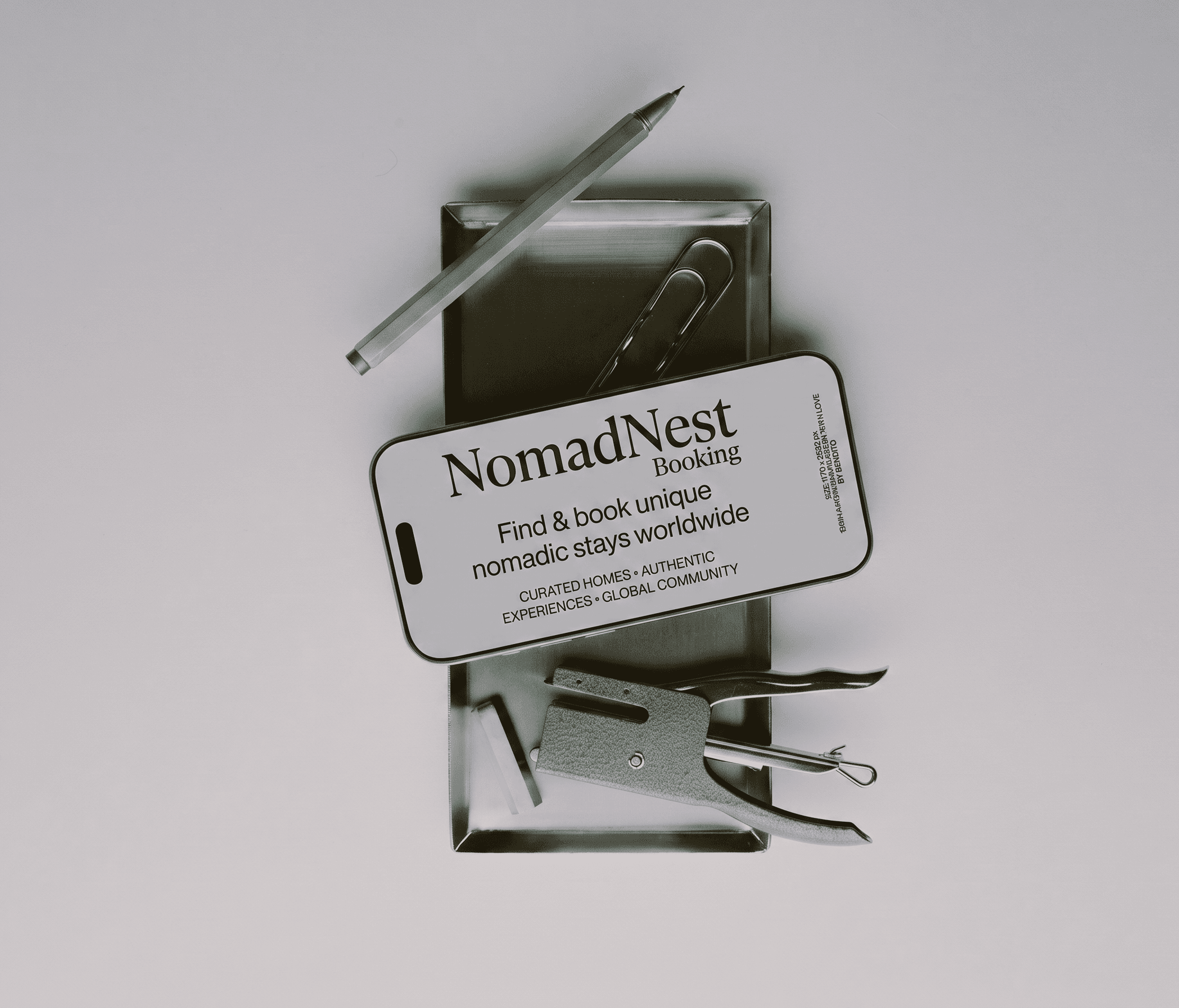
Creating a clearer travel booking experience for stronger user confidence
The project focused on turning scattered information into a structured experience that helped modern travelers understand value, evaluate options, and act with greater confidence.
Deliverables
Strategy
A focused strategic foundation clarified priorities, audience needs, and the strongest path for improving project outcomes.
Design
A refined interface system improved hierarchy, usability, and visual consistency across every important project touchpoint.
Content
Clearer messaging and structured content helped users understand value faster and move through the journey confidently.
Launch
Final QA, responsive checks, and handoff guidance prepared the experience for a smooth and reliable release.
Approach
We combined research, content strategy, and interface refinement to understand user hesitation, remove unnecessary complexity, and shape a digital journey built around confident stay selection.
1.
PHASE
Insights
We reviewed existing content, user questions, analytics signals, and support feedback to identify the moments where modern travelers felt uncertain, distracted, or unsupported.
2.
PHASE
Planning
We reorganized the journey around user intent, defining clearer priorities, stronger messaging, and simpler pathways that supported confident stay selection without adding complexity.
3.
PHASE
Design
We translated the strategy into structured wireframes, testing hierarchy, content placement, and flow logic before committing to final interface details.
4.
PHASE
Checkout
We designed a polished visual system with consistent components, accessible hierarchy, and focused interaction patterns that made the experience feel reliable and easy to use.
5.
PHASE
Features
The booking system needed practical details that supported traveler confidence while preserving the sense of discovery that made the brand distinctive and memorable.
Filters: Search controls were simplified around real traveler priorities like dates, location, budget, and amenities.
Listings: Property cards showed clearer pricing, availability, and experience highlights before users opened details.
Checkout: Fee explanations and confirmation steps were made easier to review before final booking.
6.
PHASE
Conversion Review
We tested the revised journey against common booking concerns, checking whether users could compare stays, understand total cost, and complete reservations without confusion. The review helped refine the final release plan.
Comparison: Listing patterns were reviewed for faster scanning and more confident shortlisting.
Trust: Policies, reviews, and host information appeared closer to decision points.
Mobile: Key booking actions stayed visible and usable on smaller screens.
Turning travel inspiration into confident booking decisions
NomadNest became easier to explore and easier to book. The redesign kept the emotional pull of discovering unique places while removing the uncertainty that often prevents travelers from completing reservations.
More Success Stories

FAQ's
Frequently Asked Questions About NovaCore Platform
What issue did NomadNest have before redesign?

This part of the project improved the experience by making information clearer, reducing friction, and helping modern travelers move through important decisions with stronger confidence and less support dependency overall.
How did the redesign improve property discovery?
This part of the project improved the experience by making information clearer, reducing friction, and helping modern travelers move through important decisions with stronger confidence and less support dependency overall.
Were checkout and pricing flows simplified too?
This part of the project improved the experience by making information clearer, reducing friction, and helping modern travelers move through important decisions with stronger confidence and less support dependency overall.
Did mobile booking receive special attention? for users and stakeholders
This part of the project improved the experience by making information clearer, reducing friction, and helping modern travelers move through important decisions with stronger confidence and less support dependency overall.
What made the final experience more trustworthy?
This part of the project improved the experience by making information clearer, reducing friction, and helping modern travelers move through important decisions with stronger confidence and less support dependency overall.
Inhalte
Overview
Why?
Development Process
Why Choose?
Related Project
Get in Touch
FAQ's
Improving travel booking clarity for faster decisions and fewer doubts
The previous travel booking experience created unnecessary friction for modern travelers, making important information harder to find, compare, and trust before taking the next step forward.
We redesigned the journey around confident stay selection, simplifying content order, improving hierarchy, and removing confusing moments that slowed users during key decisions.
The final system gave modern travelers a more focused experience with clearer messaging, stronger interaction patterns, and practical guidance across the complete journey.
Creating a clearer travel booking experience for stronger user confidence
The project focused on turning scattered information into a structured experience that helped modern travelers understand value, evaluate options, and act with greater confidence.
Deliverables
Strategy
A focused strategic foundation clarified priorities, audience needs, and the strongest path for improving project outcomes.
Design
A refined interface system improved hierarchy, usability, and visual consistency across every important project touchpoint.
Content
Clearer messaging and structured content helped users understand value faster and move through the journey confidently.
Launch
Final QA, responsive checks, and handoff guidance prepared the experience for a smooth and reliable release.
Approach
We combined research, content strategy, and interface refinement to understand user hesitation, remove unnecessary complexity, and shape a digital journey built around confident stay selection.
1.
PHASE
Insights
We reviewed existing content, user questions, analytics signals, and support feedback to identify the moments where modern travelers felt uncertain, distracted, or unsupported.
2.
PHASE
Planning
We reorganized the journey around user intent, defining clearer priorities, stronger messaging, and simpler pathways that supported confident stay selection without adding complexity.
3.
PHASE
Design
We translated the strategy into structured wireframes, testing hierarchy, content placement, and flow logic before committing to final interface details.
4.
PHASE
Checkout
We designed a polished visual system with consistent components, accessible hierarchy, and focused interaction patterns that made the experience feel reliable and easy to use.
5.
PHASE
Features
The booking system needed practical details that supported traveler confidence while preserving the sense of discovery that made the brand distinctive and memorable.
Filters: Search controls were simplified around real traveler priorities like dates, location, budget, and amenities.
Listings: Property cards showed clearer pricing, availability, and experience highlights before users opened details.
Checkout: Fee explanations and confirmation steps were made easier to review before final booking.
6.
PHASE
Conversion Review
We tested the revised journey against common booking concerns, checking whether users could compare stays, understand total cost, and complete reservations without confusion. The review helped refine the final release plan.
Comparison: Listing patterns were reviewed for faster scanning and more confident shortlisting.
Trust: Policies, reviews, and host information appeared closer to decision points.
Mobile: Key booking actions stayed visible and usable on smaller screens.
Turning travel inspiration into confident booking decisions
NomadNest became easier to explore and easier to book. The redesign kept the emotional pull of discovering unique places while removing the uncertainty that often prevents travelers from completing reservations.
More Success Stories
FAQ's
Frequently Asked Questions About NovaCore Platform
What issue did NomadNest have before redesign?
This part of the project improved the experience by making information clearer, reducing friction, and helping modern travelers move through important decisions with stronger confidence and less support dependency overall.
How did the redesign improve property discovery?
This part of the project improved the experience by making information clearer, reducing friction, and helping modern travelers move through important decisions with stronger confidence and less support dependency overall.
Were checkout and pricing flows simplified too?
This part of the project improved the experience by making information clearer, reducing friction, and helping modern travelers move through important decisions with stronger confidence and less support dependency overall.
Did mobile booking receive special attention? for users and stakeholders
This part of the project improved the experience by making information clearer, reducing friction, and helping modern travelers move through important decisions with stronger confidence and less support dependency overall.
What made the final experience more trustworthy?
This part of the project improved the experience by making information clearer, reducing friction, and helping modern travelers move through important decisions with stronger confidence and less support dependency overall.

© 2026 Orbitix. Designed for the future. Built with purpose.
Crafting future-ready digital products through strategy, design, and technology. Built for innovators, startups, and businesses shaping what's next.
Let's build something remarkable together.
Whether you're launching a new idea or scaling an existing product, we're ready to help bring your vision to life.